Typography CSS Properties
There are two main groups of CSS properties that control typography style: font andtext.
The font CSS property group dictates general font characteristics such as font-styleand font-weight. Below you’ll see the p element given a font-style and a font-weight property.
p {
  font-style: oblique;
  font-weight: bold;
}

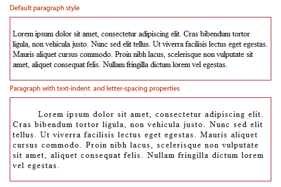
The text CSS property group deals with the characters, spaces, words and paragraphs. For example, the text-indent property indents the first line of a text block. The letter-spacing property controls the spaces between a text block. Below, you’ll see the p element given a text-indent and a letter-spacingproperty.
p {
  text-indent: 50px;
  letter-spacing: 2px;
}
There are other CSS properties that can affect web typography outside of the fonts and text property groups. For example, the color property controls an HTML element’s foreground color, and can be used to change the color of text. Below, you’ll see the p element given a red color.
p {
  color: red;
}

Font Sizing
Browser compatibility is a major issue in web design, even more so if you are attempting to make your web designs look the same in all browsers. Beginning web designers may mess around with a font’s size until it looks just right, only to find it has completely changed among other browsers and platforms. Size fonts the correct way, and this problem can be minimized.
A simple use of sizing text is as follows:
h6 {
  font-size: 12pt;
}
The above sets the heading level-6 element to 12pt.
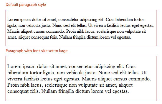
For font-size values, there are 4 types of units of measurement.
Absolute-size
Standard keywords whose values are defined by the user agent (e.g., web browser). Values in W3C CSS 2.1 specifications are xx-small, x-small, small, medium, large,x-large, xx-large.
Relative-size
Standard keywords that size fonts based on the parent element. These are also defined by the user agent. Possible values are larger and smaller. Below you will see what a paragraph element looks like inside a parent element (<div>) that has a size of 12pt (in Firefox).
div {
  font-size: 12pt;
}
p {
  font-size: large;
}
Both keyword value groups (absolute-size and relative-size) can vary greatly between different browsers, so if your aim is to be pixel perfect, they might not be a good option, and most web designers avoid them altogether.
The smaller and larger keywords, however, can be great for convenient relative sizing when exact proportions don’t matter to the design. The larger and smallervalues will inherit the parent element’s font-size and then relatively adjust the target element’s font-size accordingly. So, for example, if a parent element’s value is set tosmall, the larger keyword will make the child element larger. For most browsers, the change from exact units is around 1.2 units, although that proportion is not consistent amongst all browsers.
As an example, if text is set to 12pt, the larger keyword will resize the child element’s text to about 12pt x 1.2 (depending on the browser), which would equal14.4pt.
Absolute Lengths
Absolute lengths are literal sizes. For example, 12px is exactly 12 pixels and 2in is exactly 2 inches. Absolute lengths are often used by web designers.
Possible units for absolute length units are pt, px, mm, cm, in, and pc.
Millimeters (mm), centimeters (cm), and inches (in) are more suitable to physical, real-world dimensions and are units of measurement often used in print design. They are not very suitable for screen-based measurements because of the high variance of screen resolutions.
Points (pt) and picas (pc) — while better than mm, cm and in — can also vary visually based on the browser or device’s dpi.
Therefore, when using absolute lengths, pixels (px) are the least problematic. One issue with px, though, is that older versions of IE cannot resize them natively. If developing for an audience that will likely resize text manually through their web browser, the px unit of measurement may not be a good option. Be sure when usingpx for font sizing that accessibility is not an issue.
Relative Lengths
The other type of length units are relative lengths. This means that their sizes are dependent on the font-size assigned to their parent element. Possible units are em,% and ex.
Not many web designers use ex — it is the height of the letter “x” in the current font.
em and % values are far easier to work with. em and % act identically, and it’s just a matter of syntax:
0.5emis equal to50%1emis equal to100%0.2emis equal to20%0.73emis equal to73%2.21emis equal to221%
html, body {
  font-size: 85%; /* = (.85em) */
}

h1 {
  font-size: 110%; /* = (1.1em) */
}
The proportions are all relative to the element’s parent font-size. So, if the base font size (in body or html) is set to 80%, a child with a font-size of 0.2em or 20%would be 20% in height of the original 80%.
Font Stacks
CSS font stacks are a list of fonts that include fonts that will work well in various operating systems and platforms, with the goal of making typography as consistent as possible.
Here is an example of a font stack:
body {
  font-family: Georgia, Times, "Times New Roman", serif;
}
In the above example, the web browser will go from left to right until it finds a font in the user’s computer. For example, it will search for the Georgia font, and if it doesn’t find it, it will move on to the Times font, and so on.
There are many options for creating font stacks, and there are many popular premade font stacks available on blogs and in IDEs such as Dreamweaver.
The idea of a font stack is to provide ideal fonts that would be available on many computers, and then provide fallback fonts behind them to degrade to in case the preferred font is not available.
A good goal to strive for is to create beautiful typography for a wide range of users, but also account for the situation that the preferred font is not available to all users.
There are a few key items to keep in mind when creating custom font stacks:
- There should be a good amount of fallback fonts. Our above example only lists three, but it would be ideal if there were more.
- The fonts selected should be available on a number of platforms. For example, Arial is widely used on Windows, while its near equivalent, Helvetica, is on nearly all Macs.
- For font stacks that accomodate Linux users, check out A Web Designer’s Guide to Linux Fonts.
Best Practices for Developing Font Stacks
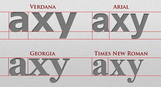
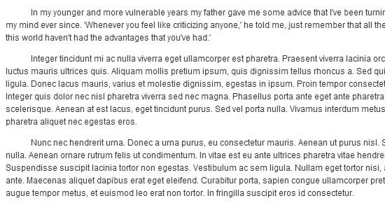
All fonts in the same font stack should have the same (or similar) aspect ratios. Some fonts are wider or taller per letter than others are, giving them larger aspect ratios.
So, if we put Verdana (mostly Windows) with Helvetica (mostly Macs), we’ve met the above requirements. However, since Verdana is much wider than Helvetica, the text will look dramatically different on most Macs compared to most Windows computers.
The image below show the difference in aspect ratio among four common Windows fonts. As you can see, Verdana and Georgia are wider and taller than both Arial and Times.
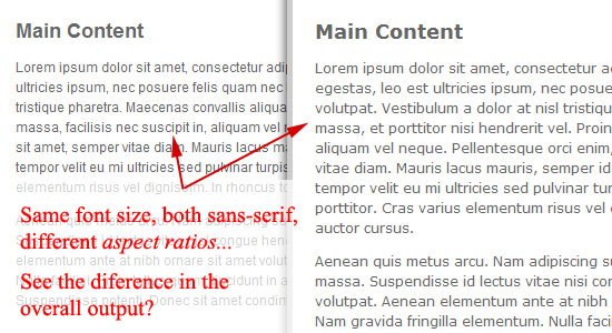
In larger blocks of text, the difference is more apparent. If we had a font stack with Verdana to accommodate Windows and Helvetica for Macs, the image below shows the significant difference.
So when developing font stacks:
- Make sure you account for the different operating systems (Windows, Mac, and Linux).
- Make sure a font stack is all sans serif or is all serif (for consistency)
- Make sure the fonts in the stack have similar aspect ratios.
Here is a list of the most common fonts for various aspect ratio types:
- Wide sans serif: Verdana, Geneva
- Narrow sans serif: Tahoma, Arial, Helvetica
- Wide serif: Georgia, Utopia
- Narrow serif: Times, Times New Roman
- Monospace: Courier, Courier New, Lucida Console
If you need more help on font stacking, CodeStyle has created a very useful font stack builder that includes all fonts between Mac, Windows, and Linux.
CSS Typography Pseudo-classes and Pseudo-elements
CSS pseudo-classes and pseudo-elements are great for targeting certain types of elements. Pseudo-classes start with a colon (:) followed by the class/element name.
There are several CSS pseudo-classes/pseudo-elements related to typography, such as :hover and :first-letter.
Let’s go over some that will help in styling our typography.
Links and Dynamic Pseudo-classes
The design of a website’s hyperlinks is very important. Use anchor link pseudo-classes to create font styles for each link state.
:hover is probably the most familiar, and it is good practice to create a separate (yet similar) style for it to provide a visual cue that a link element is interactive.
Here are the link pseudo-classes:
a:link { color: #666666; text-decoration: none; }
a:visited { color: #333333; }
a:hover { text-decoration: underline; }
a:active { color: #000000; }
First, Last, and n-th Pseudo-elements
The following pseudo-elements all relate to the position of an element relative to the HTML document and the other HTML elements in it.
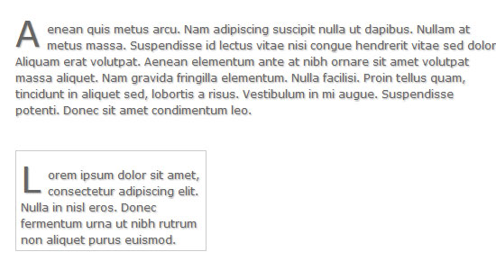
:first-letter allows you to target the first letter of an element. Here’s an example:
p:first-letter {
  font-size: 30pt;
  display: block;
  float: left;
  margin: 0 5px 5px 0;
}
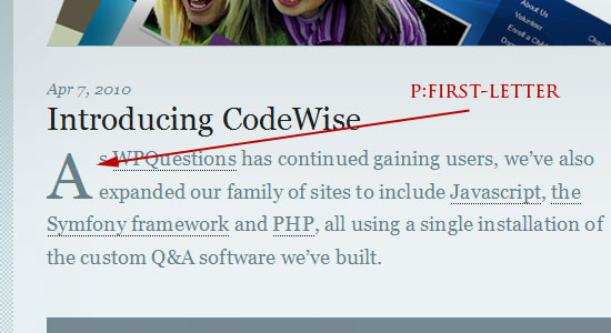
As you can see, this pseudo-element can be helpful for creating drop caps.
The :first-line pseudo-element allows you to select the first line of an HTML element containing text. Here’s an example for bolding the first line of text and making its letters uppercased:
p:first-line {
  font-weight: bold;
  text-transform: uppercase;
}

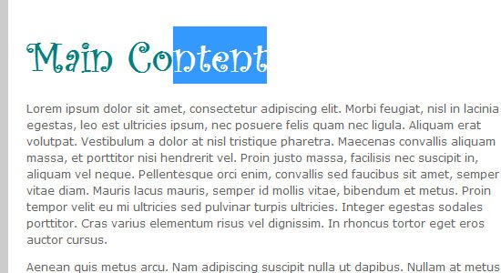
:nth-child() is a CSS3 pseudo-element that will target that nth element in a page or parent element depending on the selector’s specificity. In our example below, we target the second paragraph on the page.
p:nth-child(2) {
  background: #e7f0ce;
  padding: 10px;
}

We could also target the second paragraph within a div or the second list item in a list as follows:
div p:nth-child(2) {
  background: #e7f0ce;
  padding: 10px;
}

ul li:nth-child(2) {
  background: #e7f0ce;
  padding: 10px;
}
Also play around with :nth-child(even) and :nth-child(odd) pseudo-classes to grab even and odd elements.
There is also the :first-child pseudo-element (CSS2) and the :last-child (CSS3) pseudo-element that can select the first and last element in a set.
Better Web Typography with @font-face
For normal text blocks, using smart font stacks (as discussed in the first part) is a good idea, but for headings and short text blocks, more interesting fonts can be used with the help of @font-face.
When implemented correctly, @font-face is compatible with a wide range of browsers — yes, even IE.
Just include a copy of the font’s file on your web server and use the @font-face rule in your CSS code as follows:
@font-face {
  font-family: CurlzMTRegular;
  src: url(fonts/CurlzMTRegular.eot);
}
Then just use the font-family declared above with your CSS:
h1, h2, h3, h4, h5, h6 {
  /* Always use a font stack, even with custom web fonts! */
  font-family: CurlzMTRegular, Helvetica, Arial, sans-serif;
}
While IE4+ does support @font-face, the font does need to be in the .eot file format. Easy enough — just run any font of your choice through this converter first: ttf → eot Convertor.
For more information on @font-face, please read the following:
For easier implementation of @font-face, check out Font Squirrel’s @font-face generator.
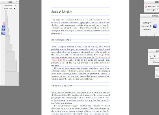
Vertical Rhythm
Designing web typography is all about legibility and readability.
A leading factor for great legibility and readability is how the text flows vertically on the page. Is the text too squished together, or is it too far apart? This is where an understanding and practical implementation of vertical rhythm can come in handy.
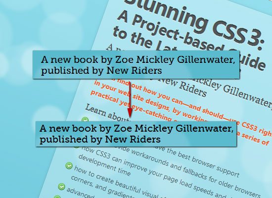
Vertical rhythm is the spacing and arrangement of text as the user reads down the page.
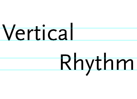 Source: Get The Eye
Vertical rhythm deals primarily with font-size and line-height, but also top/bottom margins and padding.
The concept of vertical rhythm is simple: Line heights, margins, and padding should all be equal or within even proportion.
Here’s an example:
p, ol, ul, blockquote, pre, code {
  line-height: 18px;
  margin-bottom 18px;
  /* 1.5em provides good vertical spacing ( = 150% of the font-size) */
  line-height: 1.5em;
  margin-bottom: 1.5em;
}
Consider top margins and padding with blocks of text (e.g. paragraphs, lists, block quotes), as well as with images and other block-level elements. Try to use the sameline-height or use multiples of it (e.g.18px, 32px, 64px, and so on for the example above).
Even proportions are easy to do with a bit of math. Let’s try to figure out what theline-height should be in the following example.
h1 {
  font-size: 2em;
  line-height: ?;
}
If the line-height for the body is set to 1.5em, then we just need to divide that by our font-size to maintain the proportion: 1.5em/2em = 0.75em.
h1 {
  font-size: 2em;
  line-height: 0.75em;
}
For font sizes bigger than the line-height, line-height must be decreased to match the baseline grid. For font sizes smaller than the line-height, we must increase the line-height.
We can determine the line-height for smaller font sizes with the same bit of math. Let’s try this again, but this time, our font-size is smaller than the body element’sline-height.
h2 {
  font-size: .7em;
  line-height: ?;
}
If the body‘s line-height is still 1.5em, then we’ll take it and divided by our font-size: 1.5em/.7em = 2.14em.
h2 {
  font-size: .7em;
  line-height: 2.14em;
}
For more information on creating baseline or vertical rhythm in web page layouts, look through the resources listed below. There is also a handy vertical rhythm generator, just in case you don’t want to do all that math.
- Compose to a Vertical Rhythm
- Get the Eye – Vertical Rhythm
- Setting Type on the Web to a Baseline Grid
Working with Text and Whitespace CSS Properties
@font-face and vertical rhythm can sometimes get overwhelming, so let’s slow things down a bit and get back to some basic techniques.
Text CSS Properties
The CSS text property group contains several properties for dealing with the style of text. Having a good understanding of these properties can help bring blocks of text in your designs to a more user-friendly level.
Here are some text CSS properties (their names are self-evident to what they’re for):
text-align: values can beleft,center,right, orjustifytext-decoration: values can beoverline,line-through, orunderlineorblinktext-transform: values can beuppercase,lowercase, orcapitalize
Let’s see how one of these properties works by way of an example. In the following example, we will indent the beginning of all paragraphs:
p {
  text-indent: 3em;
}
Text Direction
You can set the direction of the text by using the direction property. The default direction is ltr, which is short for left to right. Suppose we wanted to reverse that, then we can set direction to rtl.
p {
  direction: rtl;
}
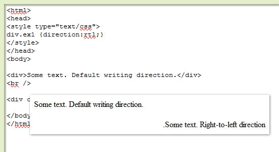
The direction property is not very popular because it has a very specialized purpose, but it can come in handy when working with other written languages. Many middle eastern languages, for example, are read right to left.
White-space, Letter-spacing, and Word-Spacing
These properties provide spacing between words and letters.
The white-space property controls how text wraps inside of its parent element. Values can be normal, nowrap, pre, pre-line, pre-wrap and inherit.
The word-spacing property affects the space in between words. Values can take any CSS unit of measurement (such as 0.5em or 5px).
The letter-spacing property is similar to the word-spacing property, however, it deals with the spacing in between individual characters instead. Values of this property can take any CSS unit of measurement.
Text Shadows
CSS3 gives us a few more CSS properties for use on web typography. One property that’s a new addition to CSS is text-shadow. Here’s the style rule for giving paragraphs a nice text shadow.
p {
  text-shadow: 1px 1px 1px #000;
}
 From: Neutron Creations
To create inset text, you can use negative values as such:
h1  {
  /* Use negative offsets to create inset text. */
  text-shadow: #000 -1px -1px 0;
}
To see text-shadow in action, check out this tutorial on how to create inset typography using CSS3.
CSS Typography Best Practices
What follows is a review of best practices that we’ve already covered, as well as a few additional ones. The key concept to keep in mind is that CSS typography is all about creating readable type that improves the user experience.
Serif or Sans serif?
There isn’t any conclusive study that indicates one group of type is more legible than the other. What affects legibility the most are the CSS properties we have discussed, such as font-size and letter-spacing.
For serif fonts, use more line-height, letter-spacing, and perhaps even word-spacing because serif fonts need some space to breathe and express their curvatures.
For sans serif fonts, the simpler font style can allow for tighter spacing and smaller font sizes with the least negative effect on legibility.
Semantic Markup
Always use proper markup. For example, use <strong> instead of <b> and <em>instead of <i>, then use CSS to style them.
Use headings (h1-h6) appropriately: to delineate sections of your content into logical groups. Using <h2> after <h1> means that the section that follows is a sub-section of<h1>. Use CSS to style them any way you want, but keep your markup semantic.
Use HTML tags to add value to the content of the HTML document, and use CSS to visually style them. For example, use <small> instead of <p>.
Create Baseline Styles
It’s always good practice to reduce the guessing game that browsers play when they can’t find a style rule for a particular element. Don’t forget to style basic HTML elements.
h1, h2, h3, h4, h5, h6 {  }
p { }
ol, ul { }
a { }
blockquote { }
pre, code { }
small { }
Use 1.5em for Line-Height
1.5em is the most common and recommended baseline line-height; it states that the line-height is +50% of the text’s font-size, giving blocks of text some vertical breathing room.
This isn’t to say that any other line-height value is bad; but when in doubt, 1.5em is a safe bet.
Using a relative unit of measurement for line-height also takes out the math involved in having to figure out the corresponding line-height, as shown in this example:
p {
  font-size: 12px/1.5em;
}
For a 12px font-size, an 18px line-height could be used to achieve the exact same result, but then you would have to recalculate what that value would be if yourfont-size changes for other elements.
Use Shorthand CSS
Always use shorthand wherever you can as it’s the conventional way of writing CSS nowadays.
Here is the shorthand structure for the font property:
font: [font-style] [font-size]/[line-height] [font-family 1, font-family 2, ..., font-family n]
For example:
p {
  font: normal 12px/1.5em Arial, Helvetica, sans-serif;
}
Case Studies on CSS Typography
Tutorials and theories can be great, but nothing says proof like a case study. Here are a handful of studies that can provide you with some real-world insights regarding typography on the web.
Southern Savers Case Study: Typography

Serif Fonts vs. Sans Serif Fonts: A Working Case Study
Fixing Web Fonts, A Case Study
Ten Great Free Fonts Cross-Browser: A Case Study in @Font-Face
CSS Typography Tools
Below is a collection of typography-related tools, with most being geared toward helping you work with CSS typography.
Typographic Grid
This premade CSS grid by Chris Coyier is composed to a vertical rhythm. It’s a great starting point for anyone working with CSS typography.
Baseline
Baseline is a typographic framework that adheres to a baseline grid. It features aCSS reset and basic style rules for HTML text, web forms, and some of the newHTML5 elements.
Typograph
This tool has a drag-and-drop interface for composing typography that aligns to aweb layout grid. There are a number of features available including an automatic mathematical scale so that you don’t have to pull out your calculator while working with CSS typography.
TypeTester
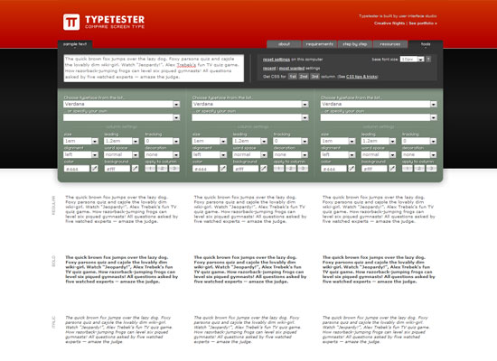
Choose fonts installed in your computer and then play around with its line-height, letter-spacing, and so forth. This tool will show you a preview on the fly so that you can conveniently tweak your font styles to your heart’s delight.
FontTester
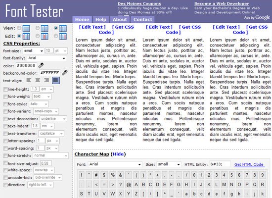
FontTester is similar in purpose to TypeTester (above). FontTester allows you to test various fonts side by side for comparing and contrasting. Test out different font combinations and styles, and then grab the CSS once you’re happy.
Typechart
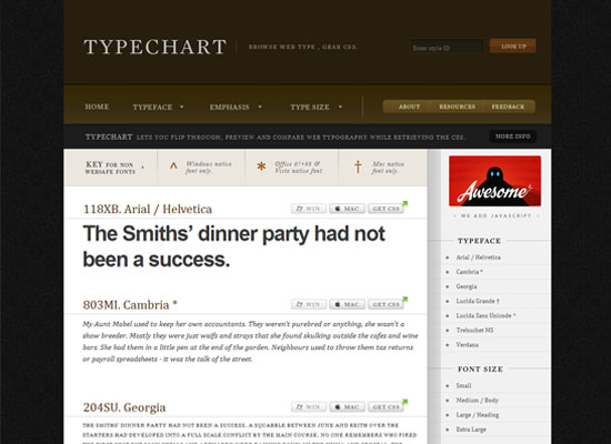
Typechart is a showcase of different font combinations, with easy-to-grab CSS for each combination. It’s great for discovering font combinations and styles quickly.
CSS Typeset Matrix
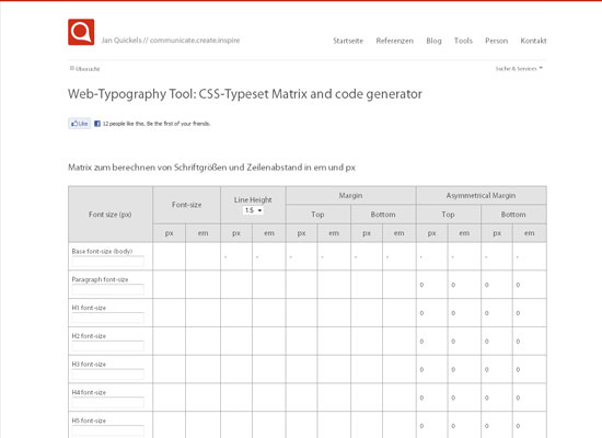
Do you think in terms of pixels? This tool will help convert your units of measurement into em as well as help you find margins and spacing values based on the font sizes and line-heights you specify.
CSS Typeset
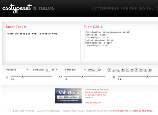
With this tool, you can change the line-height, word-spacing, color, style and text decoration of any text placed in the left input field. See the result of your tweaks immediately, and then copy-and-paste the code from the right input field.
Type Navigator
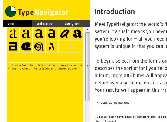
Have you ever come across a font on the web and wondered what it was? With this tool, you can figure out what font you’re looking at by answering a series of questions about its characteristics. Without a particular font in mind, you can use this tool to find a font based on features you like.
PX to EM
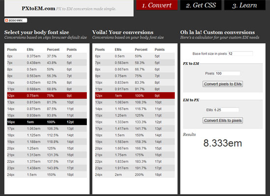
With this tool, simply pick a desired body font-size in any of the four units of measurement (px, em, % or pt) and it will convert it to em for you.
What the Font
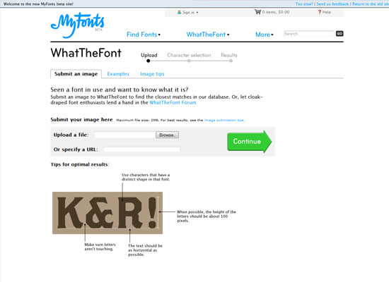
You can use this tool to learn the name of a font by uploading an image of it.
Fontifier
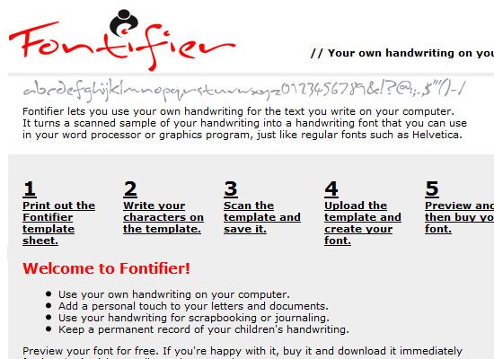
This web-based generator will create a font based on a sample of your own handwriting. The font can be used in a live site using the @font-face rule (for instance). Sampling and creating the font is free, but it costs $9 to download the font.
Serif Font Search
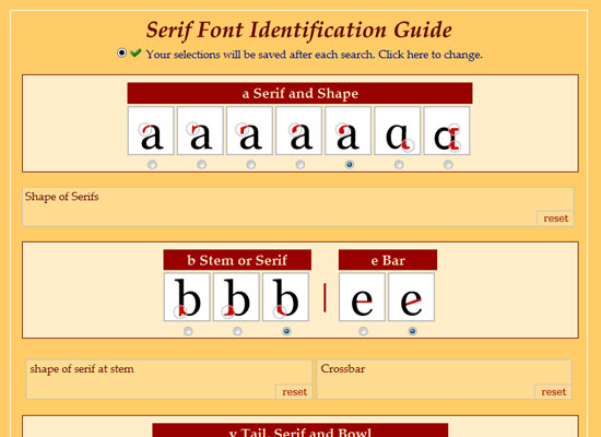
This tool allows you to search for a serif font by its characteristics. If the font you’re looking for is found, Serif Font Search will provide you its name and as well as some information about it.
Font Picker
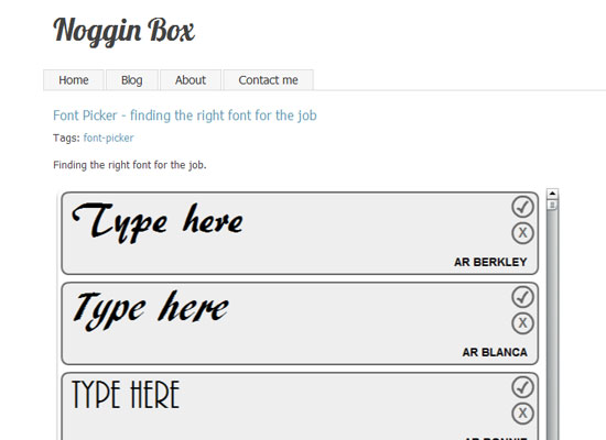
Font Picker allows you to filter through hundreds of fonts based on the characteristic and styles that you are looking for.
Typekit

For a subscription fee, web designers can use premium web fonts on their website and serve them through this web service. A big benefit to using Typekit is that there’s no need to worry about licensing restrictions of fonts you decide to use — the service does all that work for you.
CSS Typography Showcase
For inspiration, here are a few web designs that have beautiful web typography. We’ll also briefly discuss how CSS is used to compose the web design’s typography.
Matt Hamm
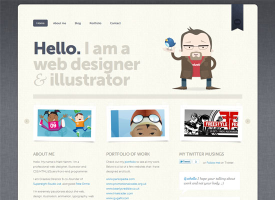
Matt Hamm has created his portfolio website around beautiful typography. The web design’s vertical rhythm is executed well and premium web fonts are served through Typekit. Notice how the web design has variations in capitalization, font size, and other font styles to create excellent visual hierarchy.
Kilian Muster

This website uses a few different CSS typography techniques. The website name and tagline leverages CSS3 text-shadow to create a subtle CSS3 inset text effect.
Grid Based Web Design

Design Informer’s custom blog post is a great example of beautiful typography in web design. The typography on this page adheres to a baseline grid and font sizes and styles between different textual elements create great visual hierarchy.
Brizk
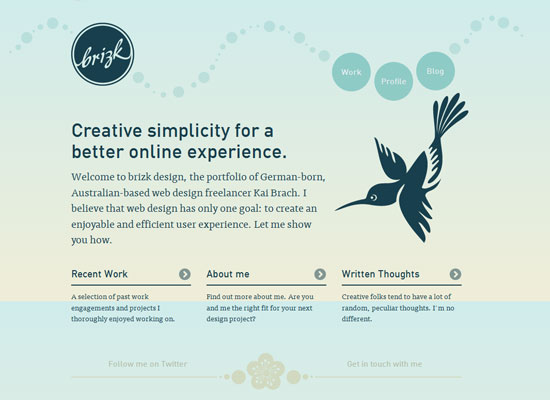
This web design is another example of how to use custom web fonts effectively. The same font is used in headings and in various text blocks throughout the website layout. Note how the first paragraph and heading on each web page is in a bigger font size — a practical use of the CSS :first-child pseudo-element discussed in thesecond part of this series.
Design View
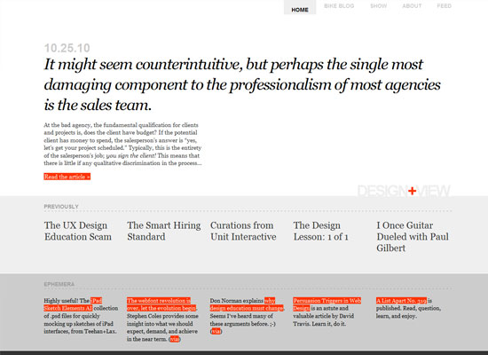
The variations in font sizes are what make this design so smart in terms of typography. Font sizes and typography spacing uses the em unit of measurement.
A List Apart

A List Apart has always been regarded as a website with excellent typography and content readability. This is because good typography is essential to a content-centered site like A List Apart, whose often-lengthy articles take center stage. The web layout features great vertical rhythm and a combination of CSS typography techniques and styles like centered text, capitalization, and an interesting hover state for hyperlinks in the articles.
Mutant Labs

This web design has excellent font styling (in terms of colors, font choices, sizes, and spacing) that results in a great typographic composition.
Jason Santa Maria

Jason Santa Maria uses CSS background-image text replacement and some basic CSS typography techniques that result in excellent legibility and readability of content. Vertical rhythm in this design is wonderful.
Darren Hoyt
CSS drop cap (discussed in the second part of this series) is used in a main paragraph on the front page of the site.
I Love Typography
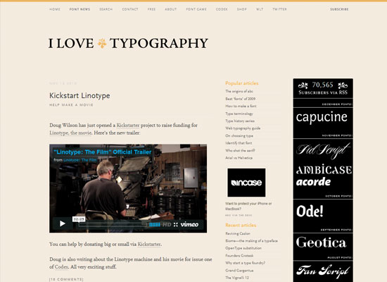
Notice that the serif fonts in this design have been given more whitespace, and sans serif fonts have been given less. This was likely done to create visual hierarchy so that the main content is the primary focal point and the sidebar content the secondary point of interest.
Further Reading and Resources on CSS Typography
Finally, here is some reading material related to CSS typography for you to look into.
- How to Size Text in CSS
- How to Size Text Using Ems
- Relative Font Sizes and Inheritance
- CSS Font Stacks (presentation)
- 8 Definitive Web Font Stacks
- Guide to CSS Font Stacks: Techniques and Resources
- Compose to a Vertical Rhythm
- Setting Type on the Web to a Baseline Grid
- Font-Face.com
- The Essential Guide to @font-face
- Type Pseudo-classes
- CSS Content